BIG SKY, MONTANA
As summer became an increasingly important part of the Yellowstone Club experience, its trail maps needed to carry the same sense of place as the rest of the brand. The existing materials communicated the essentials, but they no longer reflected the scale of the property, the variety of activities, or the warm, cinematic character of summer in Montana. Emberhouse was brought in to create a map system that could guide members clearly while feeling unmistakably Yellowstone Club.

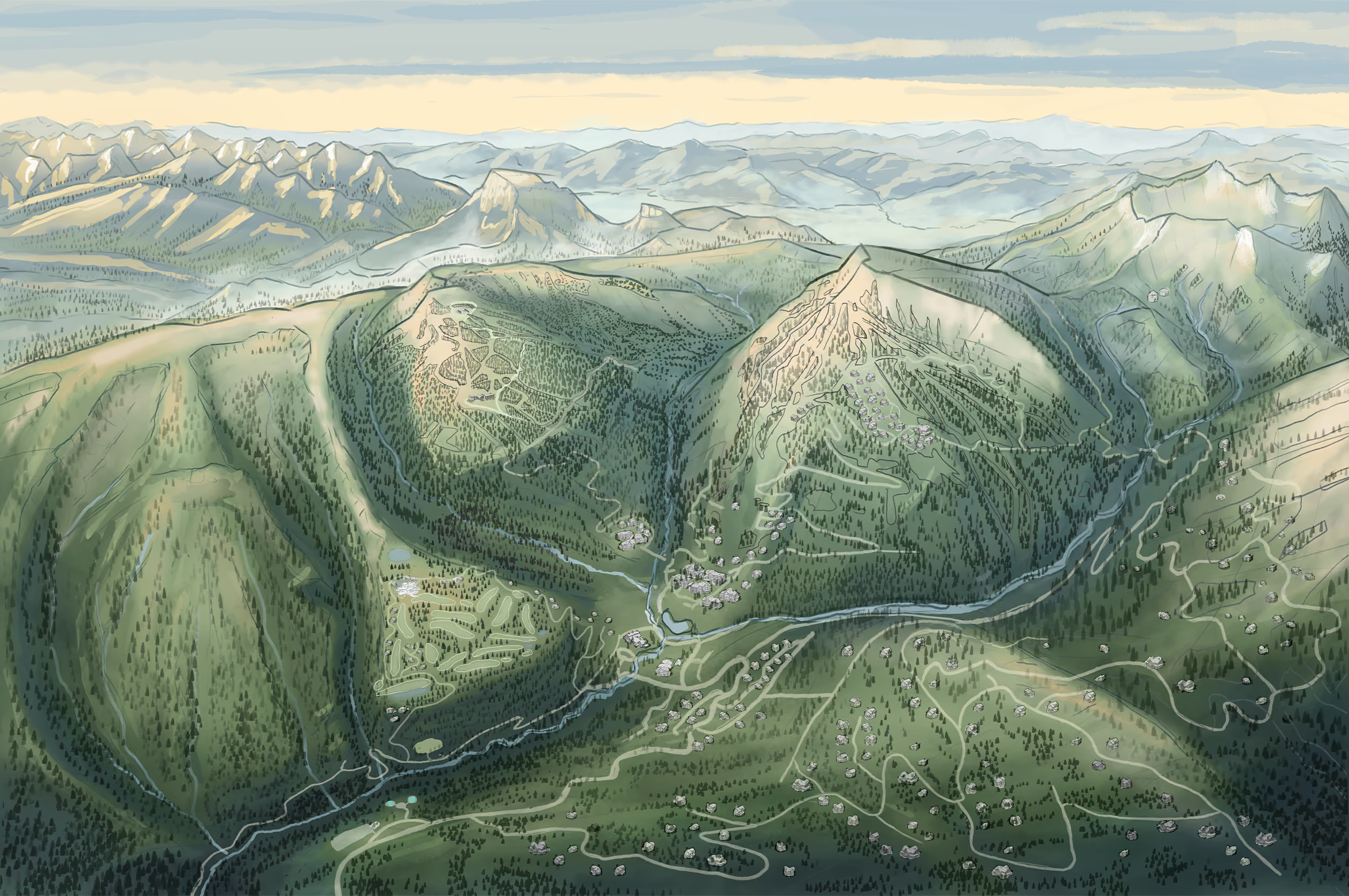
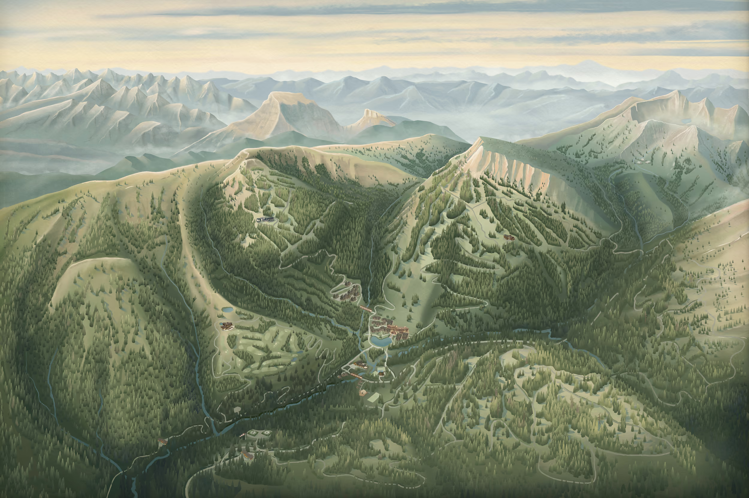
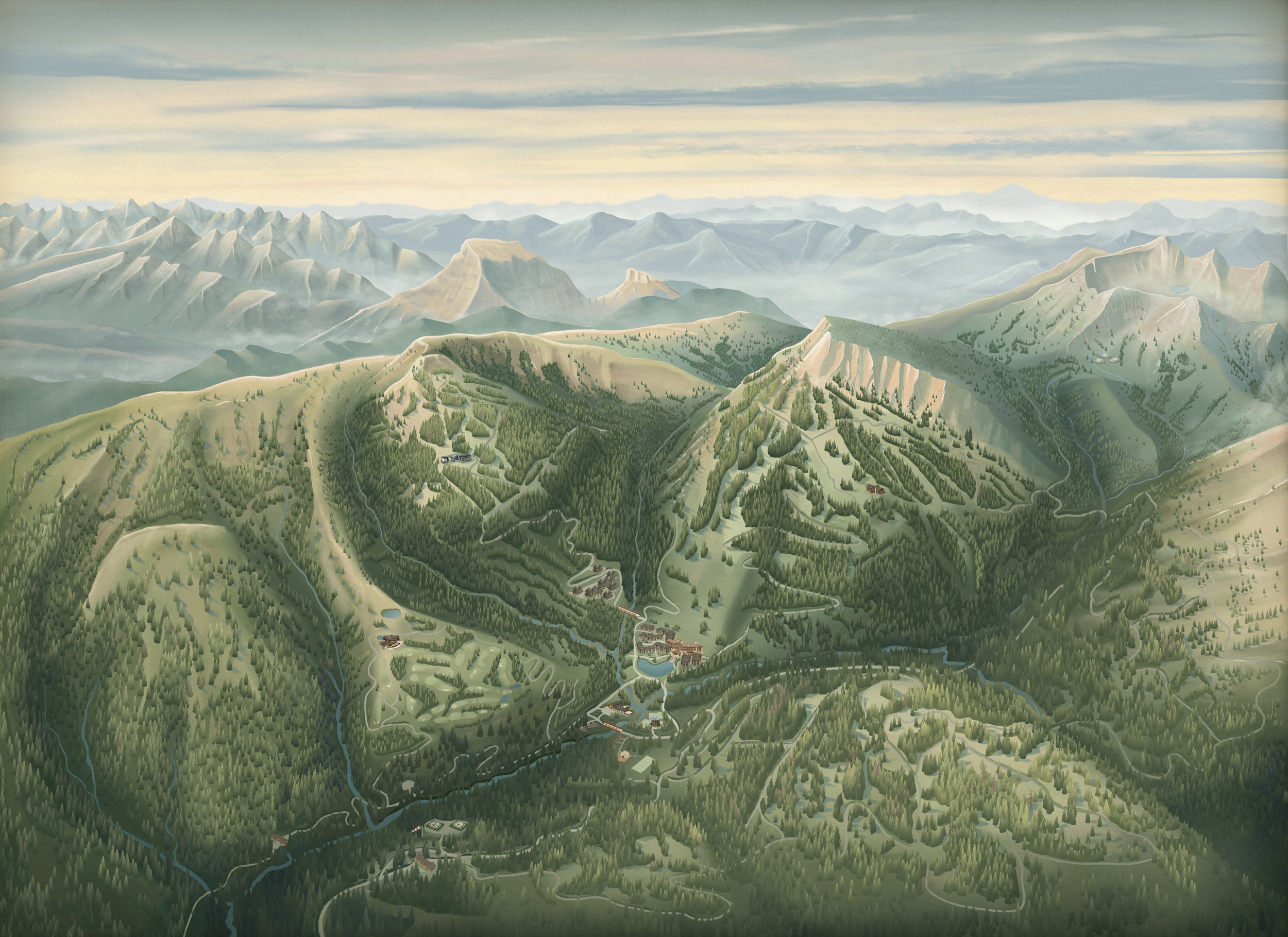
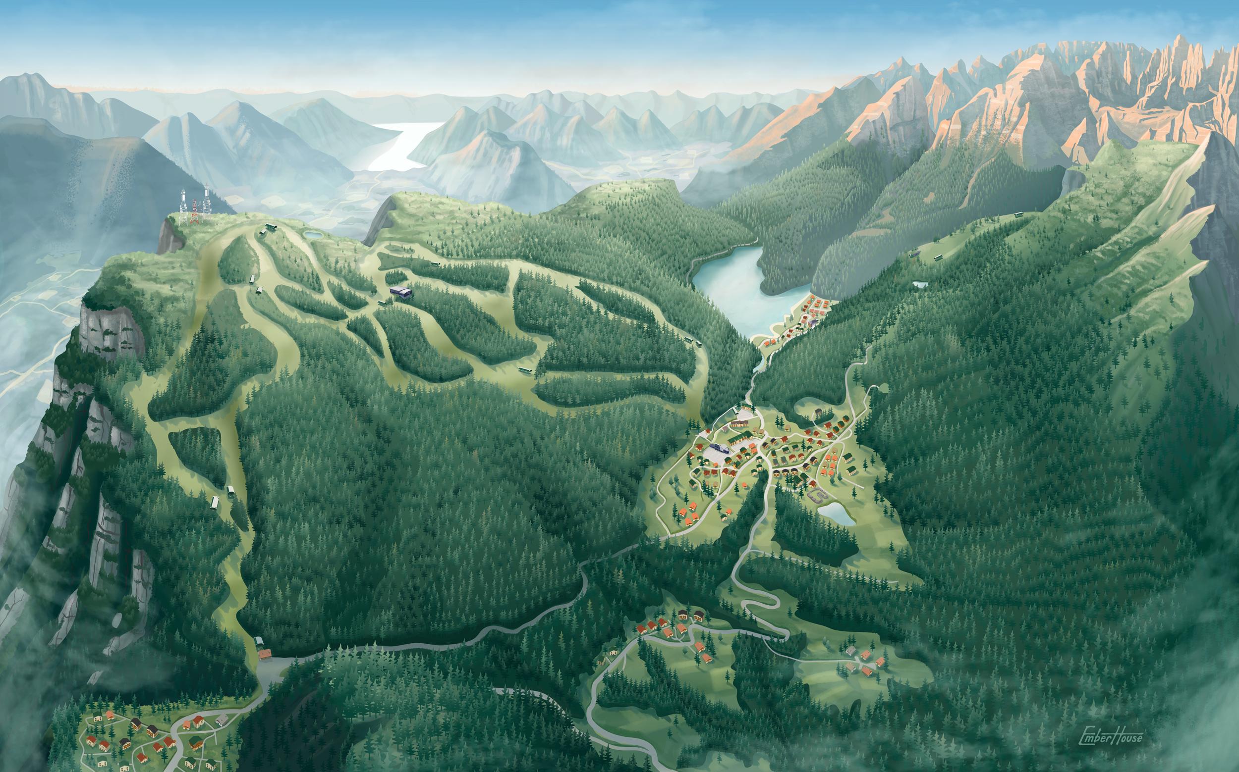
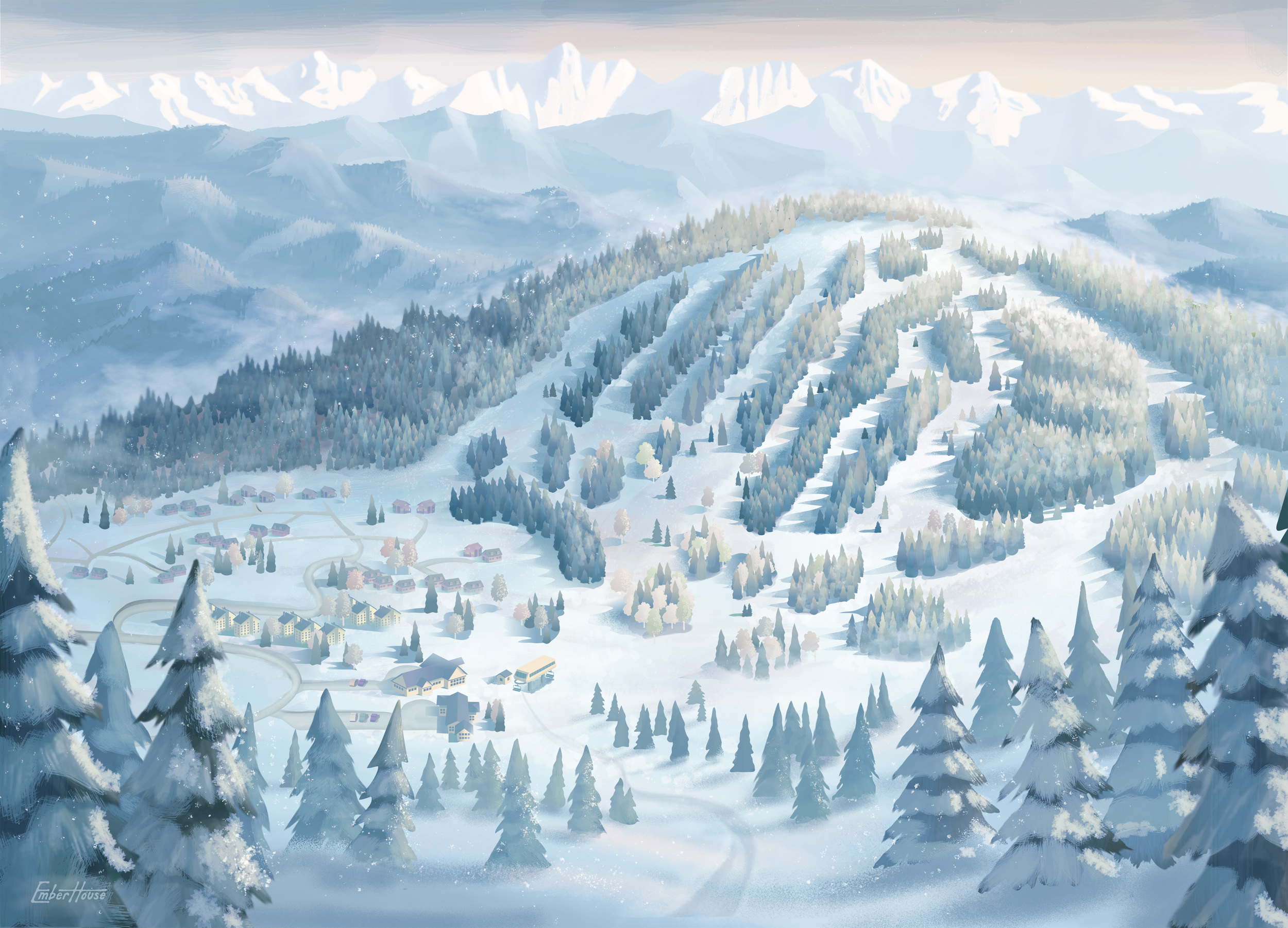
The visual direction was shaped around a single goal: capturing the feeling of summer at Yellowstone Club. Every decision, from terrain composition and forest textures to lighting, color, wildlife, and typography, worked together to create a warm, cinematic interpretation of Montana that feels unmistakably tied to the destination.
02
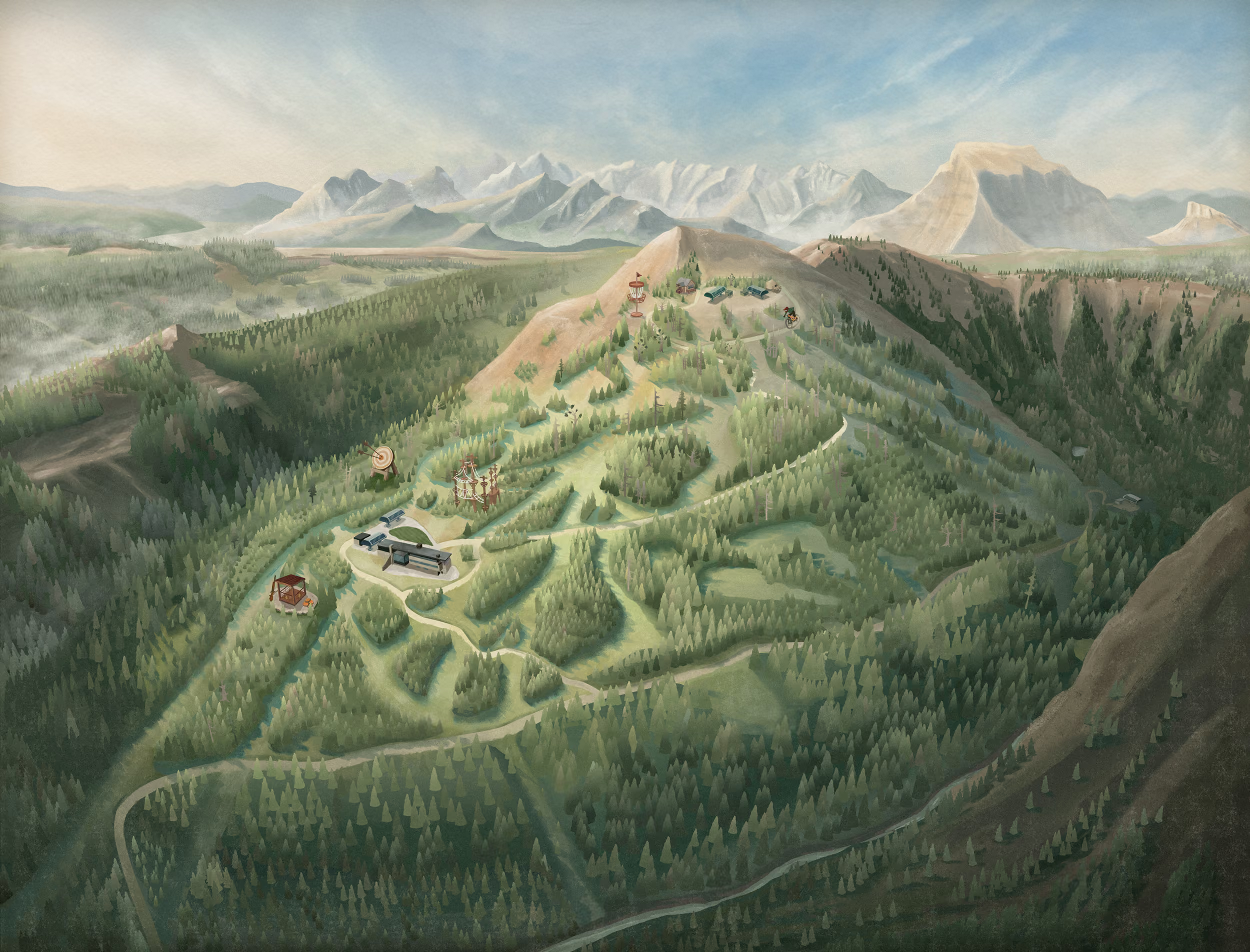
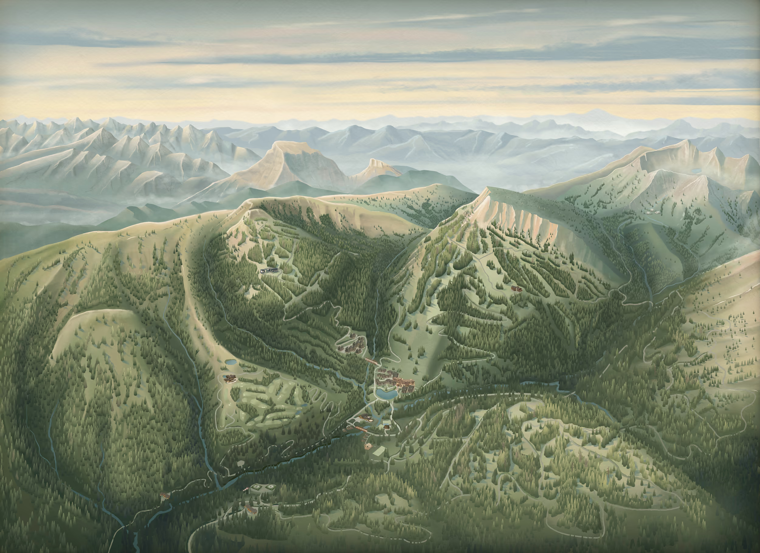
The maps use deep forest tones, dusty greens, warm earth colors, and glowing highlights to create a cinematic interpretation of the Montana landscape. Subtle film grain softens the digital finish and gives the work the atmosphere of a still pulled from an old Western.

01
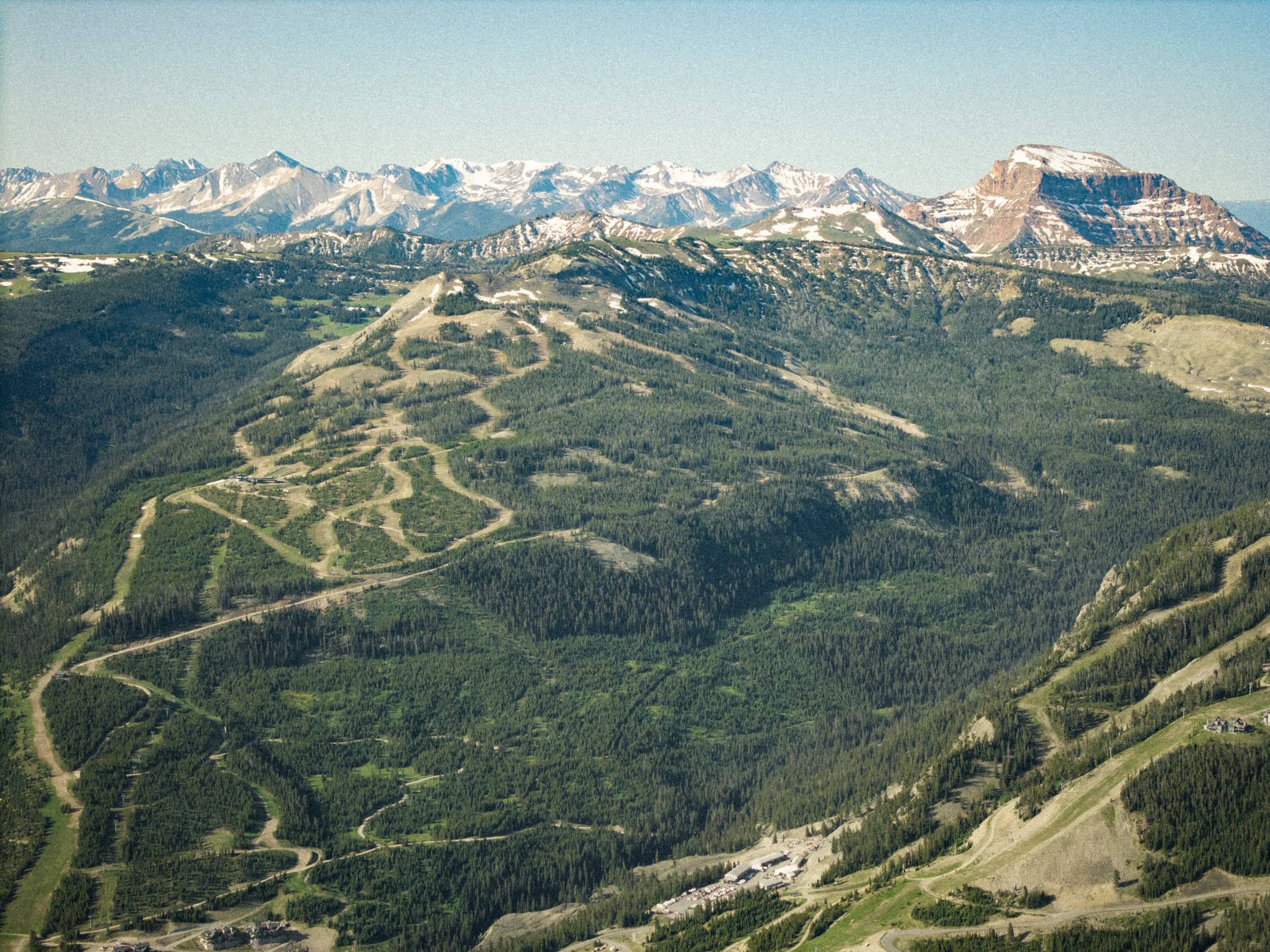
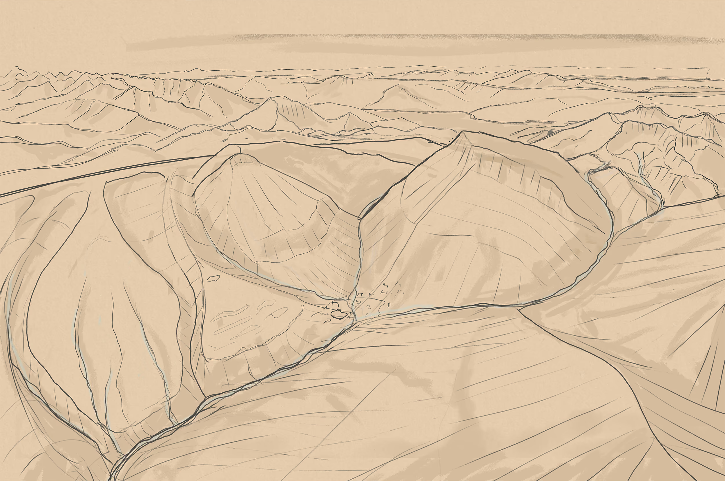
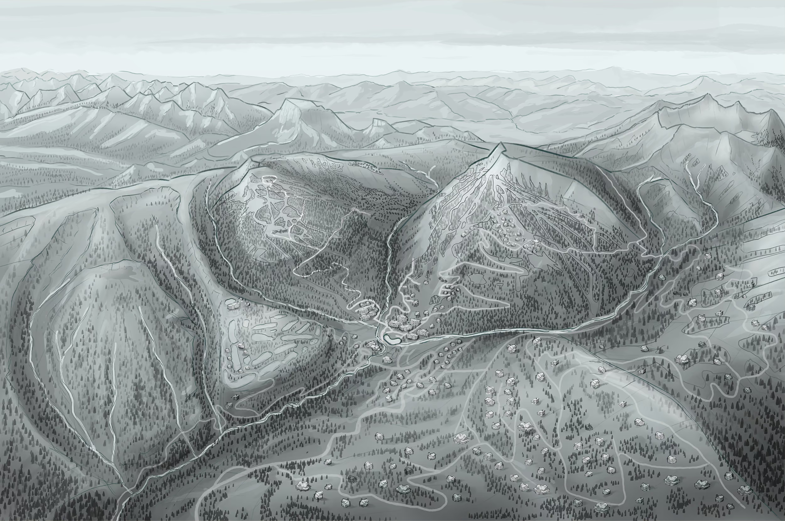
Drone surveys and on-site conversations with the marketing, recreation, and fishing teams helped us understand how different parts of the property connect. The maps were composed around the way members actually move through the landscape, while leaving room for trails and activity areas that may expand in the future.

04
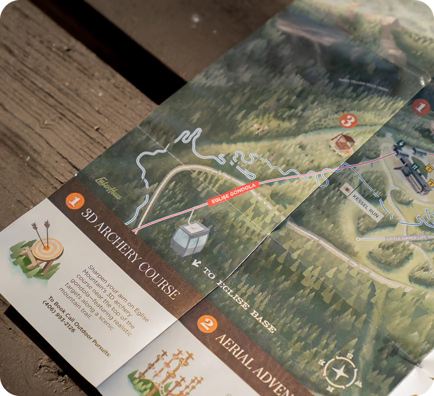
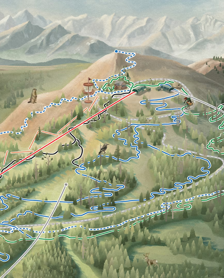
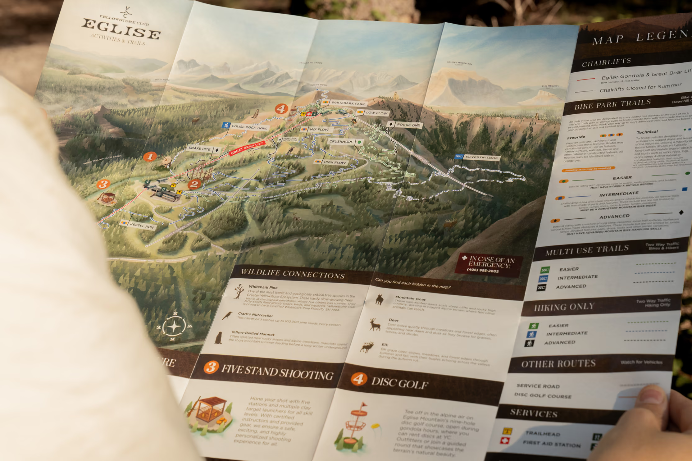
Custom illustrations bring Eglise Mountain's activities directly into the landscape, from disc golf and archery to the ropes course and shooting range. Wildlife hidden throughout the map turns navigation into discovery, while the accompanying guide helps younger members identify and learn about the animals they find.

03
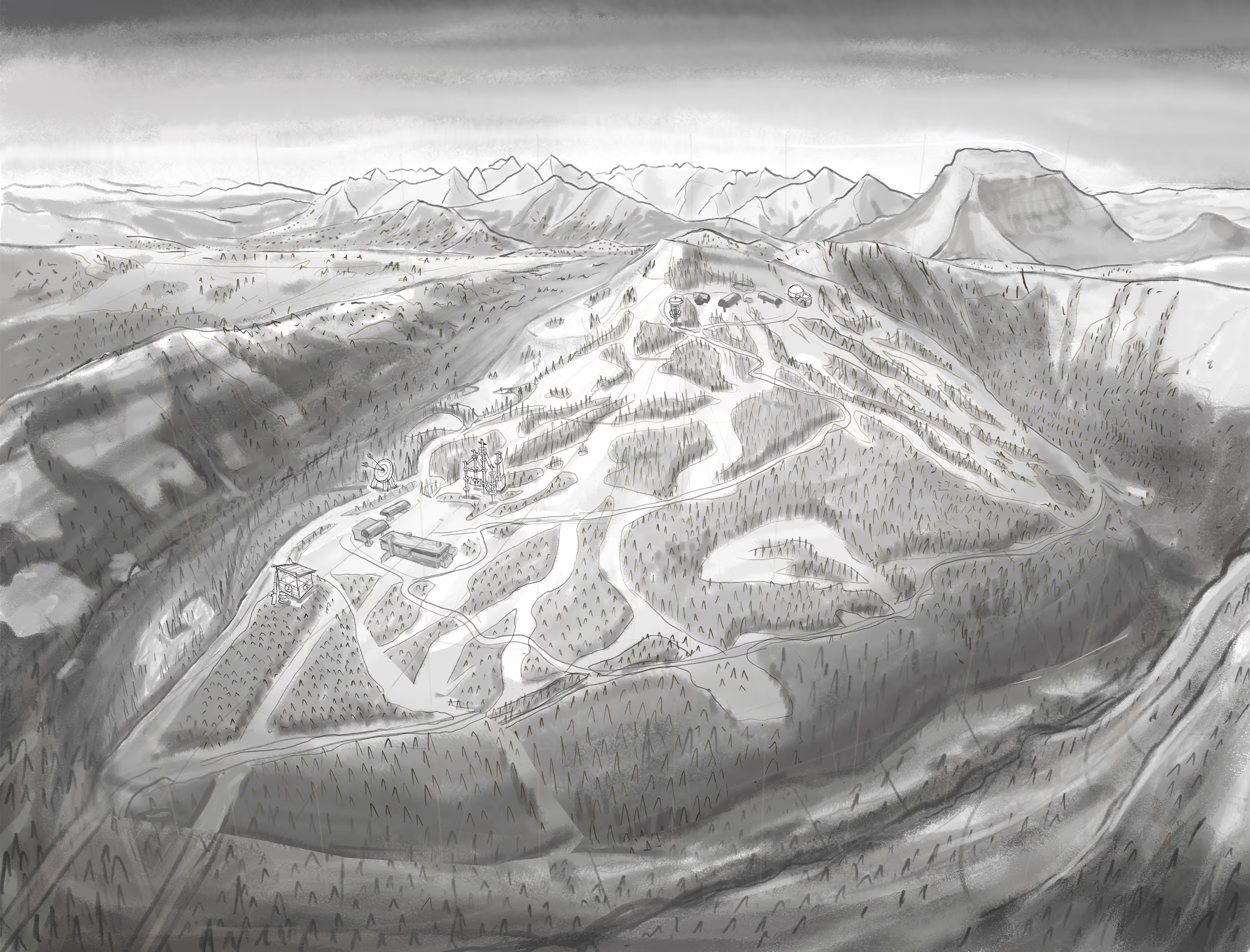
Rather than placing trail lines over the forest, the routes were cut into the illustrated canopy so they disappear behind trees and emerge again naturally. This added depth and made the trail network feel embedded in the mountain instead of drawn on top of it.

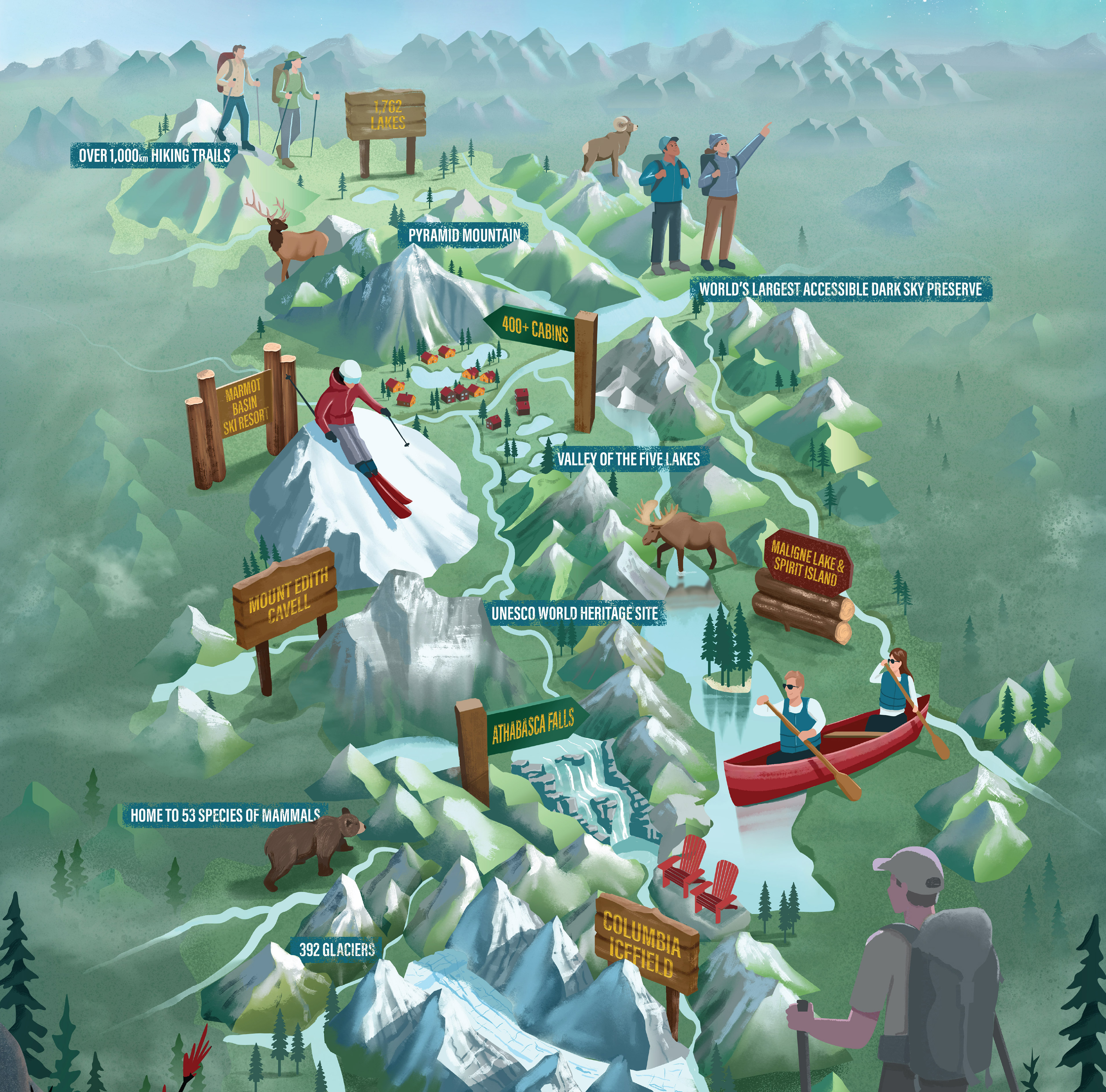
Yellowstone Club's summer experience extends far beyond its trail network, and the maps needed to reflect that. Throughout development, hundreds of visual decisions were made; from the shape of the terrain, density of the forests, and style of each type of tree, to the warmth of the color palette and placement of activity illustrations. Every decision refined to capture the atmosphere of a Montana summer. The goal wasn't simply to help members find their way, but to create a map that felt like a natural extension of the Yellowstone Club experience.
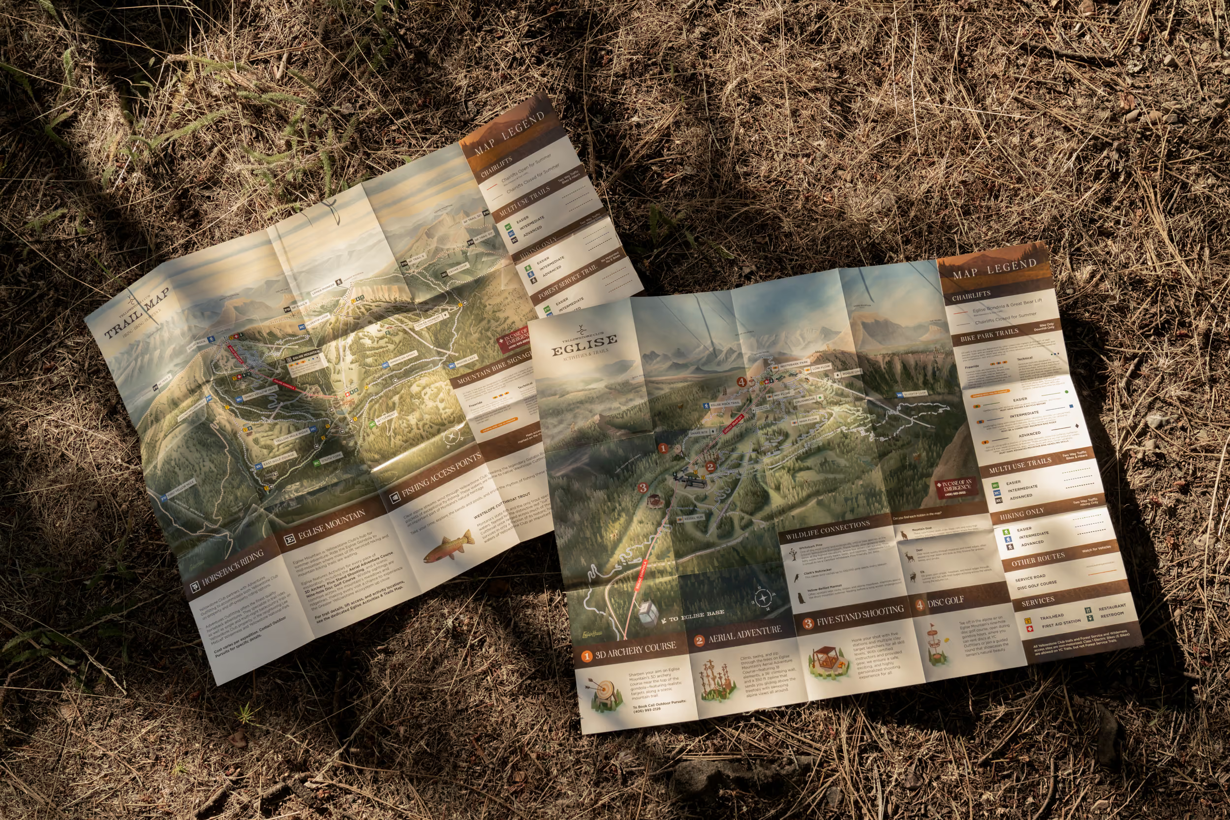
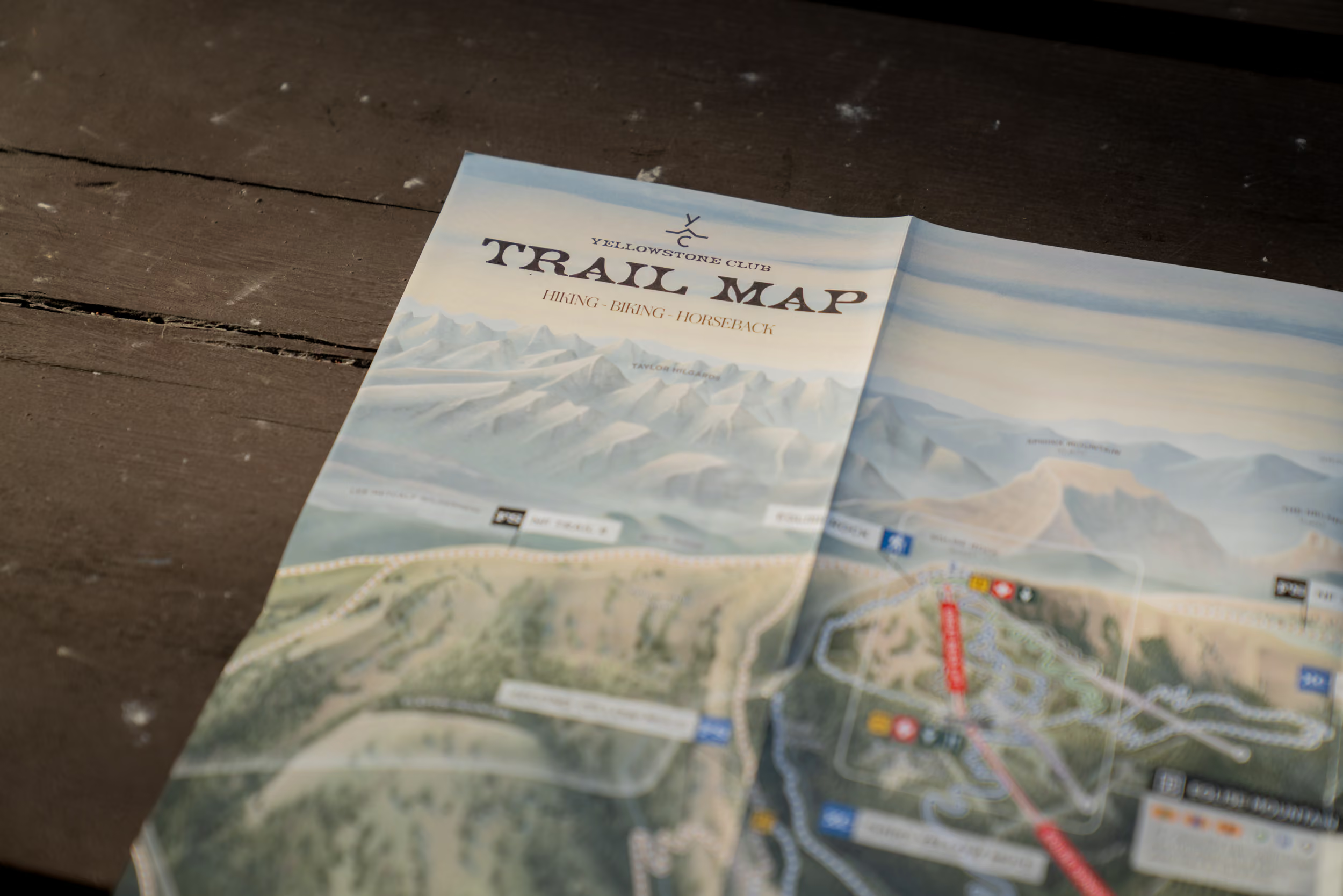
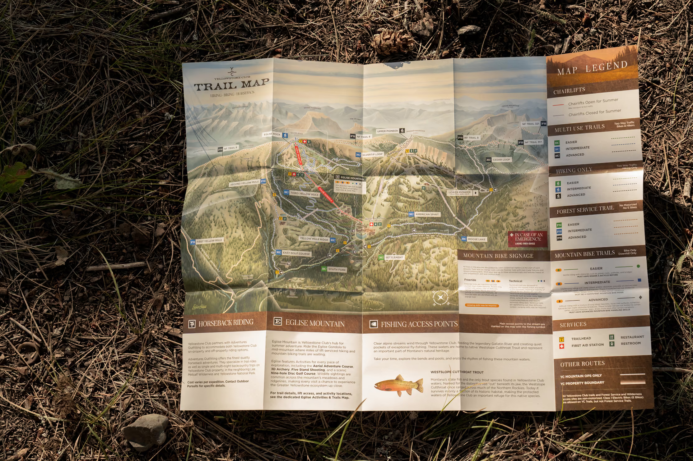
Designed to encourage exploration across the entire property, the full overview map connects Yellowstone Club's hiking trails, fishing access, surrounding forest service lands, and mountain landscape into one immersive illustration.


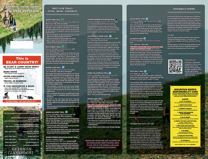
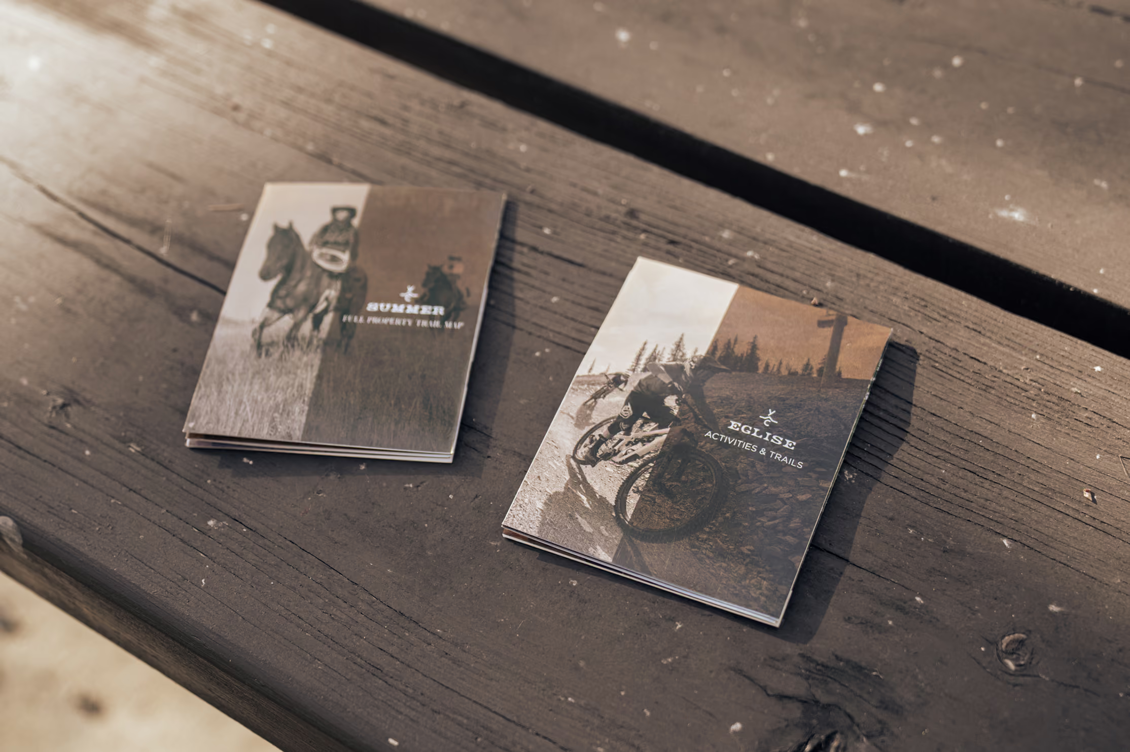
The illustration established the atmosphere, but thoughtful design made the maps easy to use. Trail classifications were reorganized with distinct colors and labeling to clearly separate hiking, mountain biking, multi-use, and Forest Service routes, while activity callouts connected members to horseback riding, fishing access points, and the companion Eglise map. Finished with warm leather textures and understated typography, the piece feels less like a brochure and more like a keepsake passport to a summer of adventure.



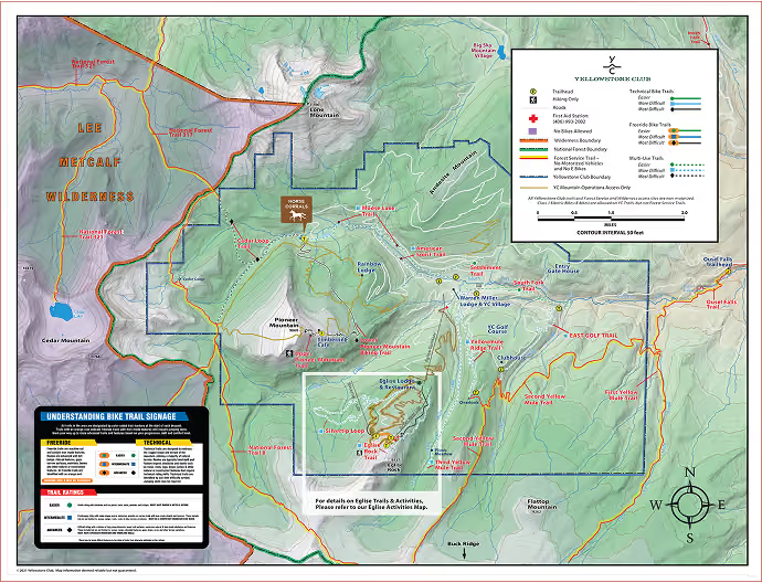
Before
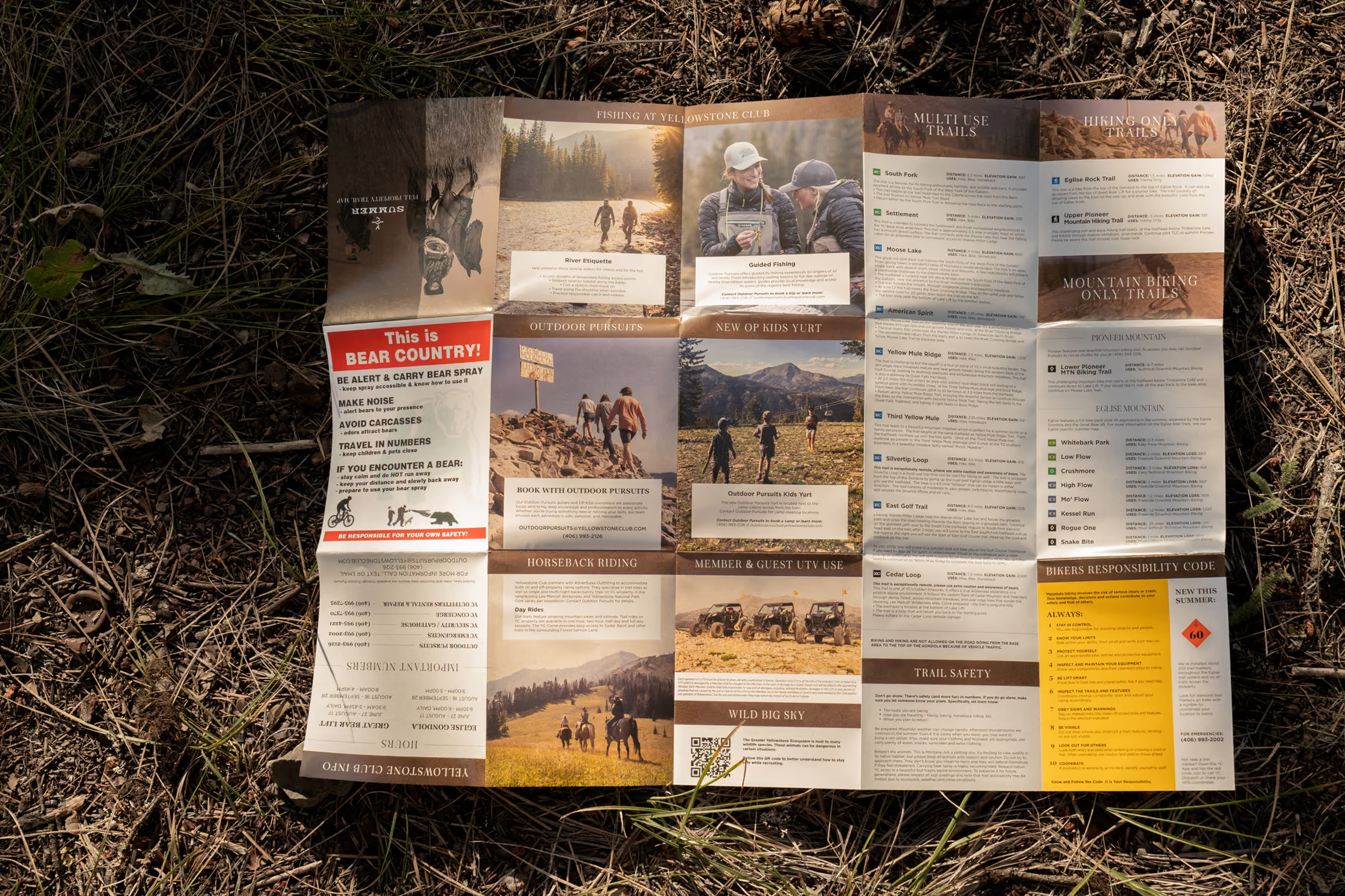
The reverse side was completely reimagined around how people actually consume information. Dense blocks of text were replaced with photography, concise descriptions, and clear visual hierarchy, making it easy for members to browse activities, understand trail etiquette, and find the information they need. The result is a guide that not only informs, but encourages exploration while making it easier for members to discover and book experiences. Every layer, from illustration to typography, information hierarchy, and print design, was developed as a single visual system rather than a collection of independent pieces.


Before
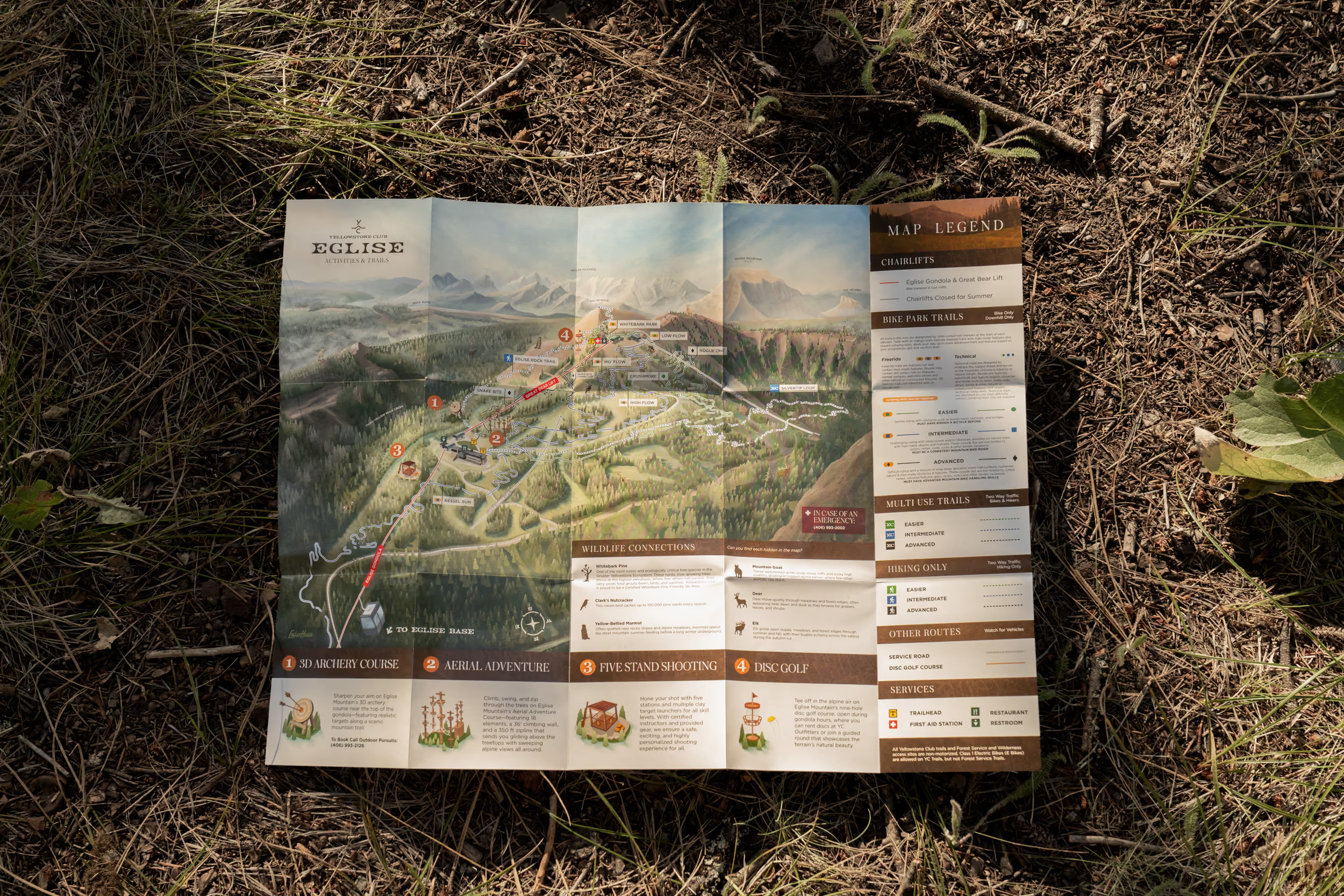
More than a bike park map, Eglise was designed as a guide to everything the mountain has to offer. Hiking trails, biking, dining, archery, disc golf, ropes courses, and scenic viewpoints all work together in a single illustration that encourages members to explore beyond the trail network.


Every element of the map was organized to make exploration intuitive. Activity illustrations and callouts highlight experiences throughout the mountain, while trails weave naturally through the landscape, helping members understand how each destination connects to the next. The result feels less like a trail map and more like an invitation to spend the day exploring Eglise.

Wildlife hidden throughout the landscape transforms the map into an interactive experience for younger members. A companion guide, "Wildlife Connections", introduces each animal while encouraging families to search the illustration together, adding another layer of discovery that extends well beyond navigation.

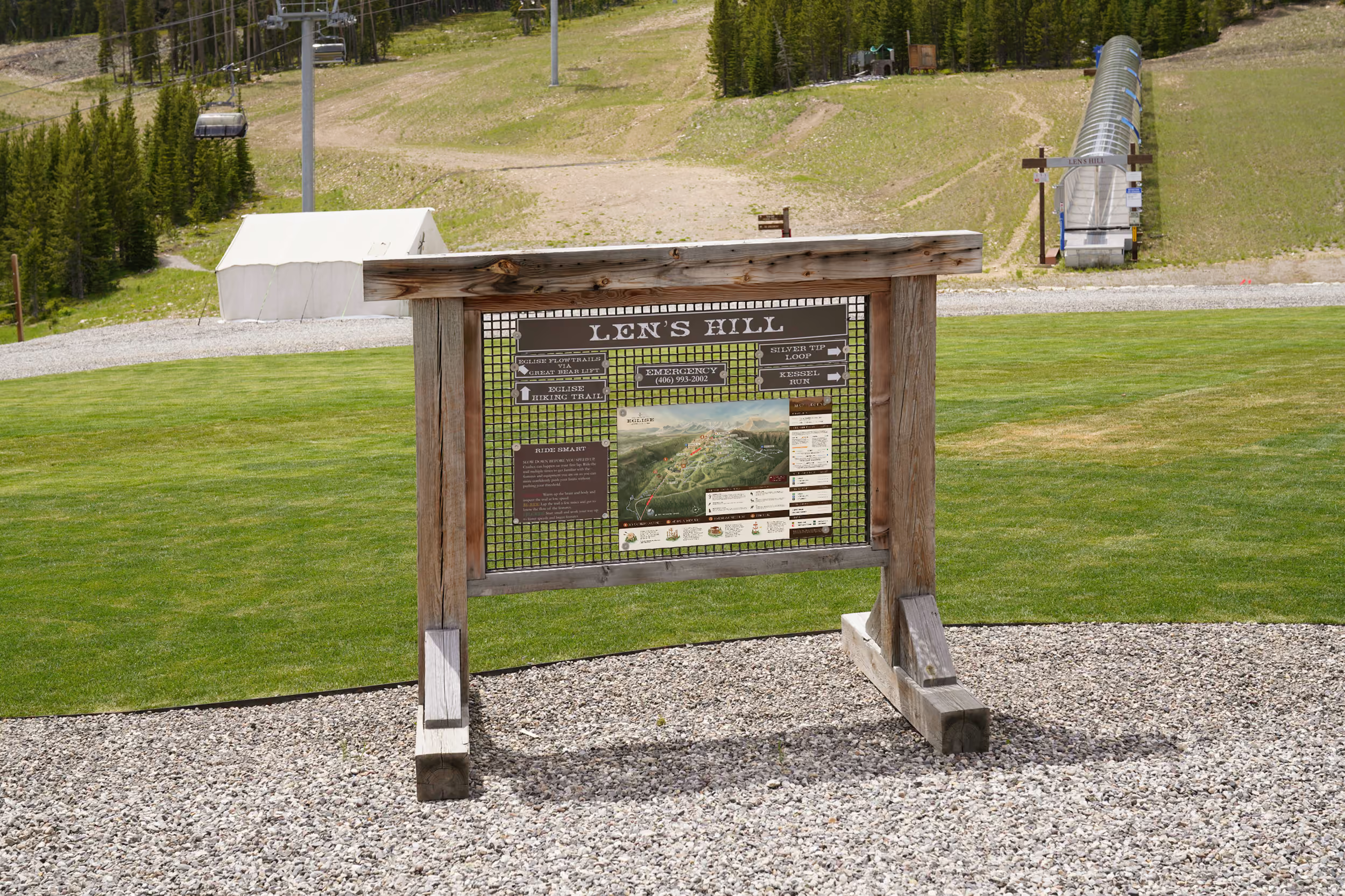
The finished maps now guide members throughout Yellowstone Club's summer season, from printed trailhead kiosks to mobile navigation and digital trip planning. By carrying the same visual identity across every touchpoint, the maps have become more than wayfinding, they've become part of the summer brand experience.


We couldn't be happier with the finished trail maps created by Emberhouse. Our previous versions were functional but lacked depth and were often difficult to read. The new maps transformed the entire experience, bringing the mountain to life with stunning illustrations while making navigation far more intuitive for our members and guests. The attention to detail, creativity, and collaborative process exceeded our expectations. These maps have become one of the most beautiful and useful resources we provide, and we highly recommend them!
Kelsey Chapman
Yellowstone Club

Thanks to Kelsey and the rest of the team at Yellowstone Club.
Start the Conversation
Contact